We have been learning about analyzing advertisements, directing our attention to the rhetoric appeals. We are learning to keep the audience in mind; and although we should feed off of what the ad shows us, we are learning to investigate what it does not. From the print to the colors down to the font size we consider the immense amount of detail, or lack of. I figure while we are rhetorically analyzing these ads in the classroom, why not practice some more.
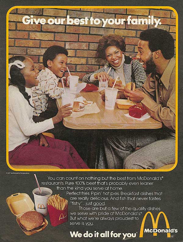
This is a McDonald's ad as you can see. If you look at the colors of the clothing and even the lighting in the picture, you can infer that this is an old advertisement. Also, if you look closely, the father's pants start to open up wide in the end which you can also infer are bell bottoms that were worn in the 70's and 80's. They choose the yellow border because of the feel you get when looking at this ad, happy. But, the yellow is not just applied any way. It serves as a thick border around the picture which I feel emphasizes the good time they are having eating McDonald's. This particular McDonald's ad is appealing to both pathos and logos. Pathos because of the family smiling. You get the sense of togetherness from the "We do it all for you" and "Give our best to your family". Words such as "we" and "you" give a personal feel to any ad because it lets us know they keep customer's interests and feelings in mind.
You may or may not be able to see it but Logos is used in the fine print. It just talks about McDonald's and its pure 100% beef probably leaner than the kind you serve at home. This also can give you the feel that this is somewhat of an old ad because we all know today, the meet McDonald's uses is not the cleanest nor the healthiest, and certainly not leaner than the kind served at home. It further goes on to note McDonald's "perfect french fries and pipin' hot pies" which appeals more to the customer because of the use of alliteration and appealing adjectives.
Is there anything in this ad that you think they purposely left out and why?
I think this ad is very typical of ones you would see in the 70's and 80's. What I think is being emphasized the most in this ad is how McDonald's can bring families closer together. In McDonald's ad campaign's nowadays, you almost never see a family in the restaurant. It is either a person or a couple who is ordering something. Clearly, even in advertising, the focus has shifted away from the family to the individual.
ReplyDeleteI disagree with you Matt. I think McDonald is still "family oriented" because even in today's commercials it is usually a mother getting happy meals for her children. I think what makes this ad seem old is that the family is sitting down at a table eating fast food where as nowadays commericals emphasize their drive-thru and the "fast-pace" aspects of their restaurants.
ReplyDeleteThe brick wall in the background also makes it appear old because we normally do not see that sort of structure in today's McDonalds.